

ARC - A solution for the blockchain novice

PROJECT TYPE
Case Study
ROLE
Sole UX/UI Designer
TIMELINE
8 Weeks
8 Weeks
iOS
ARC is the first iOS app that empowers pre-owned luxury buyers to confidently explore and transact in the blockchain ecosystem.
Design Process + Methodology

Empathize
As the luxury resale market expands, the issue of counterfeit goods remains pervasive, with counterfeits making up 60-70% of the $4.5 trillion counterfeit trade. This widespread issue not only undermines consumer trust but also damages brand reputations, affecting both sales and long-term revenue.
Blockchain technology holds the potential to solve this problem by providing a transparent, tamper-proof system for verifying the authenticity of luxury items. By 2025, 60% of companies will use blockchain solutions to authenticate products. However, only 18% of consumers have a basic understanding of blockchain, creating a critical barrier to adoption, particularly among millennials - the primary drivers of the pre-owned luxury market,.
As the luxury resale market grows, counterfeits account for 60-70% of the $4.5 trillion counterfeit trade, damaging trust and brand reputation. Blockchain offers a transparent, tamper-proof solution for verifying authenticity, with 60% of companies expected to adopt it forproduct authentication by 2025.
However, only 18% of consumers understand blockchain, creating an adoption barrier, particularly among millennials driving the pre-owned luxury market.

Pivot and Research Objective
My initial research aimed at understanding the broader application of blockchain in luxury goods authentication. However, after analyzing the data, I pivoted to focus specifically on blockchain literacy and consumer behavior within the secondary market.
To deepen my insights, I conducted secondary research, reviewing existing studies, industry reports, and competitor analysis.
I started with blockchain in luxury authentication but shifted to studying blockchain literacy and consumer behavior in the secondary market, reviewing studies, reports, and competitor analysis for insights.
Pivot and Research Objective
After distilling interview data, I identified three key themes:
(01) Authenticity Concern: Millennials avoid second-hand items without authenticity cards.
(02) Blockchain Knowledge Gap: Educating millennials on blockchain could boost confidence and sales.
(03) Price Sensitivity: Lower prices of pre-owned goods drive millennial purchases.
This led to my ‘How Might We’ statement...

The pre-owned luxury goods market is projected to reach €49 billion by 2025.
Bain & Company, "The Luxury Report 2021," 2021

The total value of counterfeit and pirated goods traded globally was estimated at $4.5 trillion in 2021.
OECD & EUIPO, "The Economic Impact of Counterfeiting and Piracy," 2021

By 2025, 60% of companies will use blockchain solutions to authenticateproducts.
McKinsey & Company, "The Future of Blockchain in Luxury Goods," 2020

Approximately 18% of globalrespondents reported having aunderstanding of blockchain technology.
PwC, "Global Blockchain Survey 2020
Primary Research
Following secondary research, I conducted in-depth interviews with millennials who regularly purchase pre-owned designer goods.
My goal was to uncover their pain points, motivations, and knowledge gaps—particularly surrounding blockchain technology.
After secondary research, I interviewed millennials buying pre-owned designer goods to explore their pain points, motivations, and behavior. I then created an affinity map to organize raw data into key themes.
User Interviews
-New York Based Public Relations Manager
-Miami Based Marketing Director
-Miami Based Nutritionist
Organizing
Insights
Organizing Insights
After conducting the interviews, I created an affinity map to organize the collected data on a granular level. I grouped insights and patterns from raw data into pain points, motivations, and behaviors to identify key themes.


Data Synthesis
After distilling raw interview data and creating an affinity map, I uncovered three key themes and insights. These helped guide the development of the 'How Might We' statement, which focuses on solving the core issue.
Key Themes + Insights
After distilling interview data, I identified three key themes:
(01) Authenticity Concern: Millennials avoid second-hand items without authenticity cards.
(02) Blockchain Knowledge Gap: Educating millennials on blockchain could boost confidence and sales.
(03) Price Sensitivity: Lower prices of pre-owned goods drive millennial purchases.
This led to my ‘How Might We’ statement...
How might we make blockchain technology more accessible to millennial second-hand luxury consumers, in order to build their confidence in purchasing pre-owned items?
User Persona

Experience Mapping
As I explored Stella’s persona, I imagined her entire online shopping journey—from initial interest to purchase. I focused on both her actions and the emotions driving her decisions. Mapping her path, I identified friction points like navigating listings or concerns at checkout, while also finding opportunities to enhance her experience.
As I explored Stella’s persona, I mapped Stella’s current shopping journey, focusing on her actions and emotions. This revealed friction points and opportunities to improve her experience.

User Stories
With Stella’s past experience in mind, I crafted user stories that focused on her needs and goals. These stories were structured with 'As a', 'I want to', and 'so that' to ensure features deliver value, rather than just listing actions.
After analyzing Stella's shopping experience, I created user stories based on her needs and goals. One focused on blockchain's role in the pre-owned market:
‘As a pre-owned luxury consumer new to blockchain, I want to learn what blockchain is used for, so I can gauge its benefits.'

Primary User Story
Afterward, I focused on a key user story that addressed the need for clear, digestible information about blockchain's role in the pre-owned market. This user story served as a solution to the 'How Might We' statement, guiding my design decisions to build trust with users and make blockchain feel more relevant and less intimidating.
As a pre-owned luxury consumer new to blockchain, I want to learn what blockchain is used for, so that I can gauge its benefits
Task Flow Planning
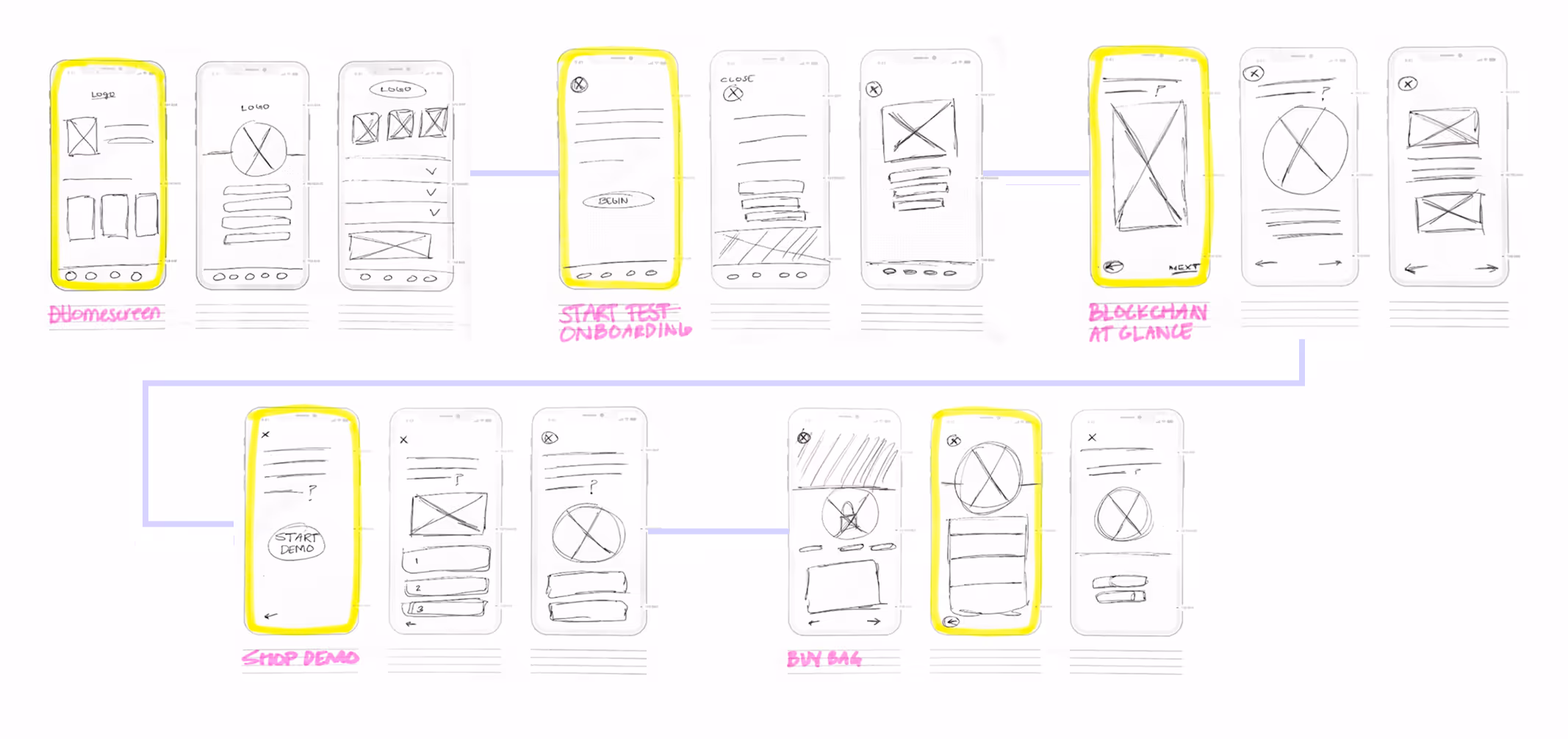
Task flow planning involves designing the steps a user takes to achieve a goal. Using Stella’s persona, the blockchain-based app, and the core epic of educating the user, I crafted a task flow that would guide her through the process of understanding product authenticity.
I created a task flow to guide Stella through understanding product authenticity. After peer feedback on the unclear blockchain explanation, I pivoted to break the info into smaller, digestible pieces.
Initial Task Flow

Refined Task Flow


Ideate
After finalizing the task flow, I moved into the ideation phase, gathering user interface inspiration to shape the visual aspects of the user journey. This was more challenging than expected, as a pre-owned luxury app on blockchain doesn’t yet exist. To overcome this, I explored blockchain, accessibility, and educational apps for inspiration, blending elements from each to guide my design process.
I moved into ideation, and with no reference available, I drew inspiration from blockchain, accessibility, and educational apps to shape the user journey.

Exploratory +
Solution Sketches
Exploratory + Solution Sketches
Using an amalgamation of elements from blockchain, accessibility and educational apps, I sketched the screens needed for the onboarding flow. After exploring different options, I selected the strongest concepts and refined them into solution sketches.
Using an amalgamation of elements from blockchain, accessibility and educational apps, I sketched the screens needed for the onboarding flow. After exploring different options, I selected the strongest concepts and refined them into solution sketches.
I combined blockchain, accessibility, and educational app elements to sketch onboarding screens, then refined the best concepts into solution sketches.
Prototype
During the prototype phase, ideas start to take shape as interactive models, bringing concepts to life. It’s a time to test how the onboarding flow functions in real-time, allowing users like Stella to understand how blockchain works. With a working version in hand, I explored user flows, identified issues, and refined the design before moving into development.
In the prototype phase, I created interactive models to test the onboarding flow, helping users like Stella understand blockchain. I refined the design by exploring user flows, identifying issues, and making improvements before development.
Lo-Fi Prototype
Building on my solution sketches, I translated my ideas into a V1 Lo-Fi wireframes, bringing the concepts to life in a tangible form to quickly map out structure and functionality without getting lost in visual details.

Test
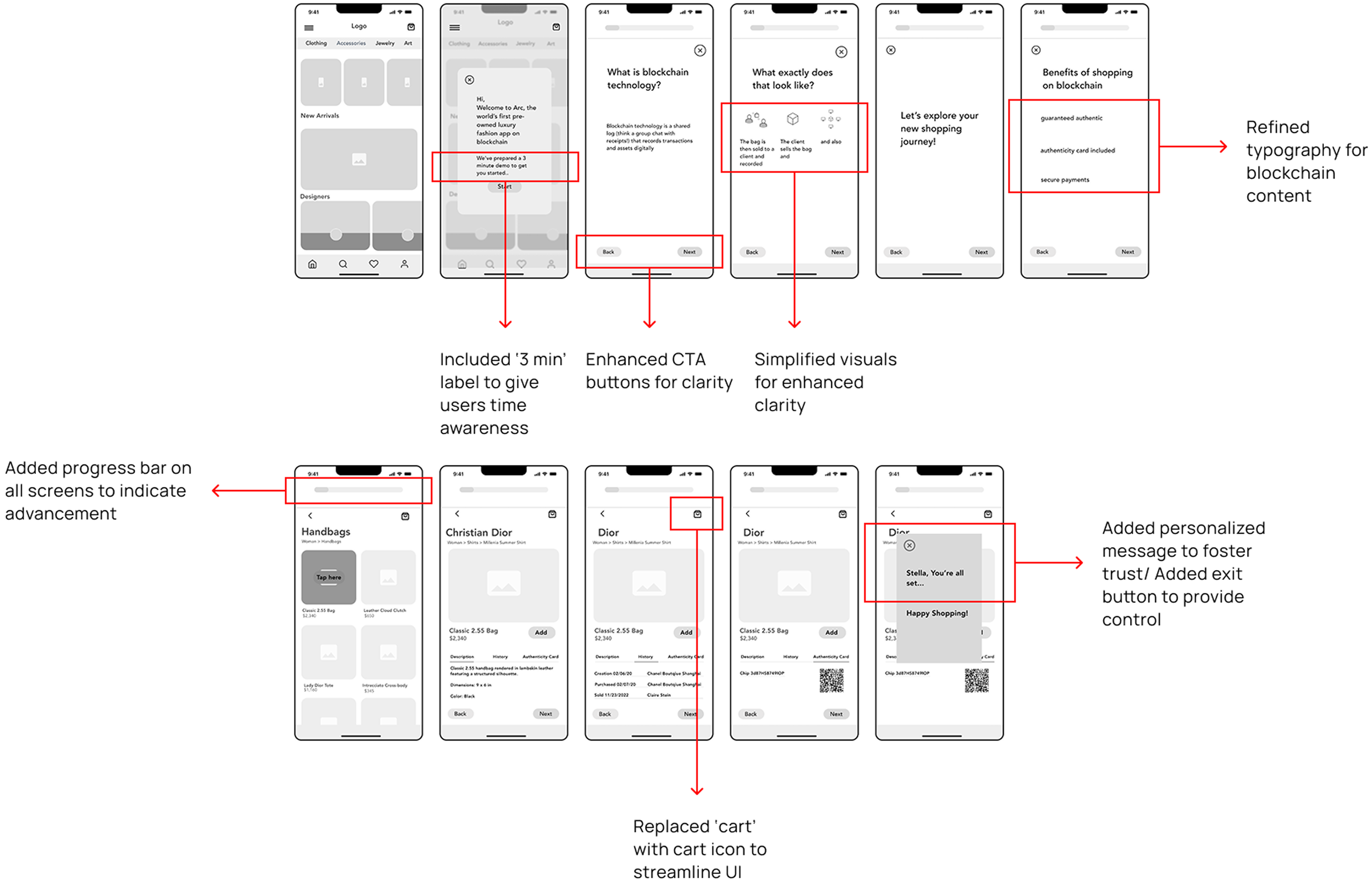
After creating low-fi wireframes, the next step was testing the app’s usability. I conducted two rounds of testing with five users each, observing how they interacted with ARC and identifying areas for improvement. The key revisions centered on expanding and simplifying the explanation of blockchain technology to ensure clarity for users.
Test
After creating low-fi wireframes, I tested the app’s usability with two rounds of user feedback, focusing on simplifying the blockchain explanation.
Usability Test Round 1
For my user testing, I selected participants who mirrored Stella. In a moderated session, I guided them through five key tasks, observing their behavior closely. As they interacted with the design, I gathered both qualitative insights andquantitative data.

Prioritization Matrix
After gathering feedback, I created a prioritization matrix to weigh each issue by impact and effort. This helped me identify the edits that would most improve the user experience.

V3 Wireframes
After the second round of usability testing, I modified the wireframe to enhance alignment with user needs.

Usability Test Round 2
Then, I tested the revised wireframes in a follow-up usability session.

Prioritization Matrix
Post-feedback, I created a prioritization matrix again to assess issues by impact and effort, helping me identify key edits and stay on track with the deadline.

V3 Wireframes
After the second round of usability testing, I modified the wireframe to enhance alignment with user needs.
Refine
With the prototype in place, it was time to bring ARC to life. I crafted the brand’s visual identity to feel intuitive and trustworthy. I developed a mood board and crafted a color palette that conveyed both trust and luxury. The logo and brand elements were designed to feel modern, technological yet approachable, aligning with the core values of transparency, reliability, and luxury.
Refine
I brought ARC to life with a visual identity that blends trust and luxury, using a mood board, color palette, and a modern logo that reflects its core values of transparency and reliability.
Lo-Fi Prototype
Building on my solution sketches, I translated my ideas into a V1 Lo-Fi wireframes, bringing the concepts to life in a tangible form to quickly map out structure and functionality without getting lost in visual details.
Mood Board
Starting with a mood board to set the tone, I sourced images guided by the following words: Confident, Modern, Energized, Transparent, Polished, Effortless, and Playful.

Color Exploration + Accessibility
I extracted colors from the mood board to define the core palette. From the combinations below I chose the electric blue and muted lavender-grey as my brand colors. The eclectic blue symbolizes technology and the muted purple-grey evokes the polished feel of luxury fashion.
I then used an accessible color palette builder to ensure clarity for all users, including those with visual impairments.
Color Exploration + Accessibility
I extracted colors from my mood board to define ARC’s core palette, choosing electric blue for tech and muted lavender-grey for luxury.
Using an accessible color contrast checker, I ensured clarity and balanced modern, blockchain-inspired tones with inviting shades for a comfortable shopping experience. The goal was to highlight innovation while ensuring ease for all users.


UI Colors
I finalized the UI colors for the app, carefully balancing modern tones that reflect the innovative nature of blockchain with more familiar, inviting shades to create a comfortable shopping experience.
The goal was to ensure the colors resonated with the app's cutting-edge technology while making users feel at ease while browsing and purchasing.
UI Colors
I finalized the app's UI colors, blending modern blockchain-inspired tones with inviting shades for a comfortable shopping experience, highlighting tech while keeping users at ease.

Name
I chose the name ARC because its shape mirrors the curves of circular economy diagrams, symbolizing sustainability. The arc conveys strength, while its rounded corners feel approachable.
In addition to the visual symbolism, I chose the name because it reflects fashion terms like Accessories, Ready-to-Wear, and Couture, but also aligns with the trend in tech, where shorter 3-4 letter names are easier to memorize and brand.
Name
I chose ARC for its circular economy symbolism, representing strength and approachability. It also ties to fashion terms like Accessories and Couture, while fitting the trend for short, memorable tech names.
Watermark
The typeface Helvetica was chosen for its timeless, clean, and modern look, reflecting the premium nature of the goods offered. Its simple, neutral design ensures the focus remains on the products, allowing their quality and authenticity to take center stage.
The clarity of Helvetica also communicates trust, reinforcing the transparency and security embedded in blockchain technology.
Watermark
I chose Helvetica for its timeless, clean design, reflecting premium quality, authenticity, and trust, while aligning with blockchain transparency.

Icon
With no existing digital solution to address my problem space, I dove into competitive research. I explored popular blockchain apps and luxury fashion apps, seeking inspiration and insights.
It helped me envision what a unique blend of the two could look like, combining the innovative potential of blockchain with the sophistication of luxury fashion.
Icon
With no existing solution, I researched blockchain and luxury fashion apps to envision a unique blend of innovation and sophistication.

UI Library
After finalizing ARC's brand identity, I adopted Atomic Design to structure the interface. I created a UI library with reusable components—atoms, molecules, organisms, templates, and pages to ensure consistency and efficiency.
This scalable design system streamlined my workflow, with the 4 C’s—consistency, continuity, context, and complementarity—guiding the process to deliver a seamless interface across platforms.
UI Library
After finalizing ARC's brand identity, I used Atomic Design to create a scalable UI library with reusable components, ensuring consistency and efficiency. Guided by the 4 C’s—consistency, continuity, context, and complementarity—this system enabled a seamless cross-platform interface.

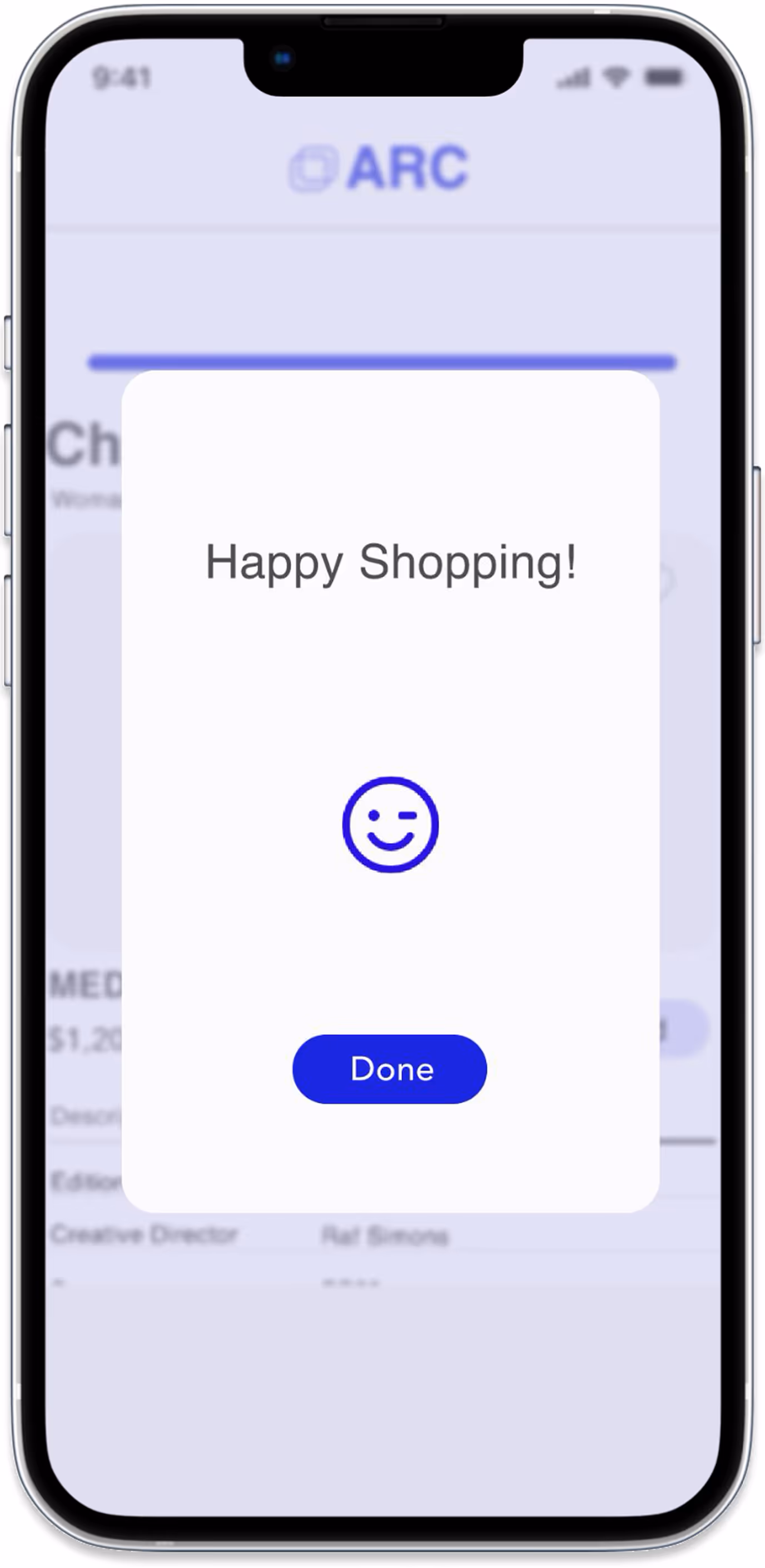
Hi-Fi Prototype
After refining the design, I created the high-fidelity prototype—the final result that brought the app to life!
Key
Take
aways
KeyTak aways
Cross-industry inspiration unlocks innovation.
Borrowing UX elements from crypto, assistive and language learning apps led to features that felt both familiar and fresh in a consumer context.
User Trust is Built Through Education.
What might be considered a meaningless extra step, such as teaching users about blockchain during onboarding, could ultimately become the key to fostering trust, increasing understanding, and driving more confident purchases in the marketplace
Human-centered iteration is non-linear.
What initially seemed like detours, such as reworking flows and reframing features, were actually the steps that brought me closest to real user empathy and clarity.